
iOS 26 Icon Clock
Print Profile(1)

Bill of Materials

Description
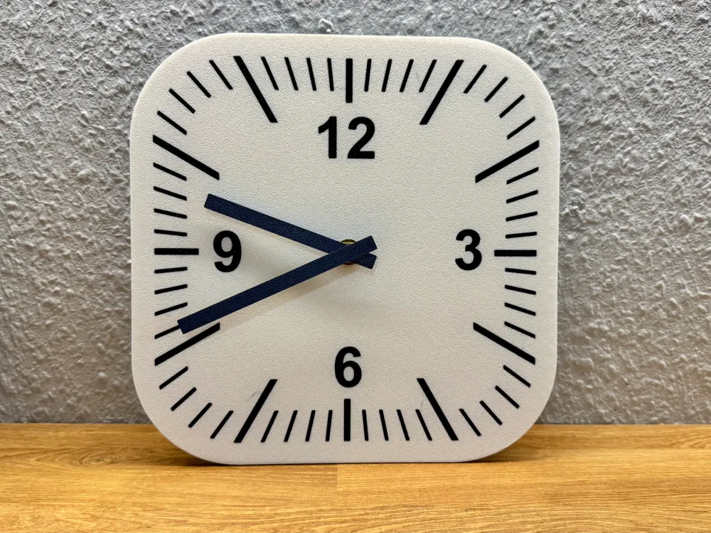
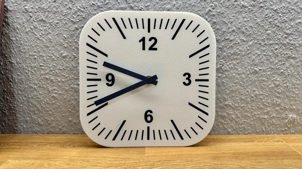
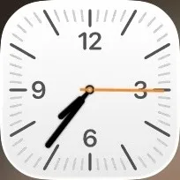
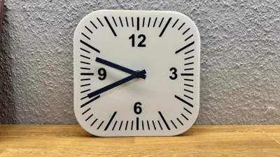
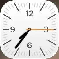
This wall clock is unapologetically nerdy: it is designed to look like the iOS 26 clock app icon brought into the real world. The square body with rounded corners, matte white face, and bold black markings follow the clean, ultra-flat style familiar from your home screen. The large numerals at 12, 3, 6 and 9 and the dense ring of ticks reproduce the layout of the digital icon so closely that it feels like the app has just escaped your phone and landed on the wall.
Design and appearance
The face is kept deliberately minimal: bright white background, strong black graphics, no logo and no distractions, so the clock reads like a piece of UI design rather than classic analog decor. The long hour and minute markers give the dial a precise, technical look, reminiscent of railway or airport clocks but filtered through modern mobile design.
Use and placement
This model is perfect for anyone who spends too much time looking at a phone and now wants the same vibe on the wall. It fits naturally into studios, offices, gaming rooms, and maker spaces, where a slightly geeky design joke is more than welcome. On a light or textured wall it becomes a clear focal point; on a darker background the white dial pops and makes the bold graphic design stand out even more.
Why this model
Unlike generic wall clocks, this model is a conversation starter: everyone who knows the iOS interface will recognize the reference immediately and usually smile. It is a fun way to show love for modern interface design while still having a fully functional, easy-to-read analog clock. For makers and tech fans, it combines two worlds: physical 3D-printed object and digital icon aesthetics in one clean, playful piece.
License



Comment & Rating (0)