When I designed my original crystal dragon, the goal was simple:
create something eye-catching, chaotic, and full of sharp, aggressive detail.
And it worked.
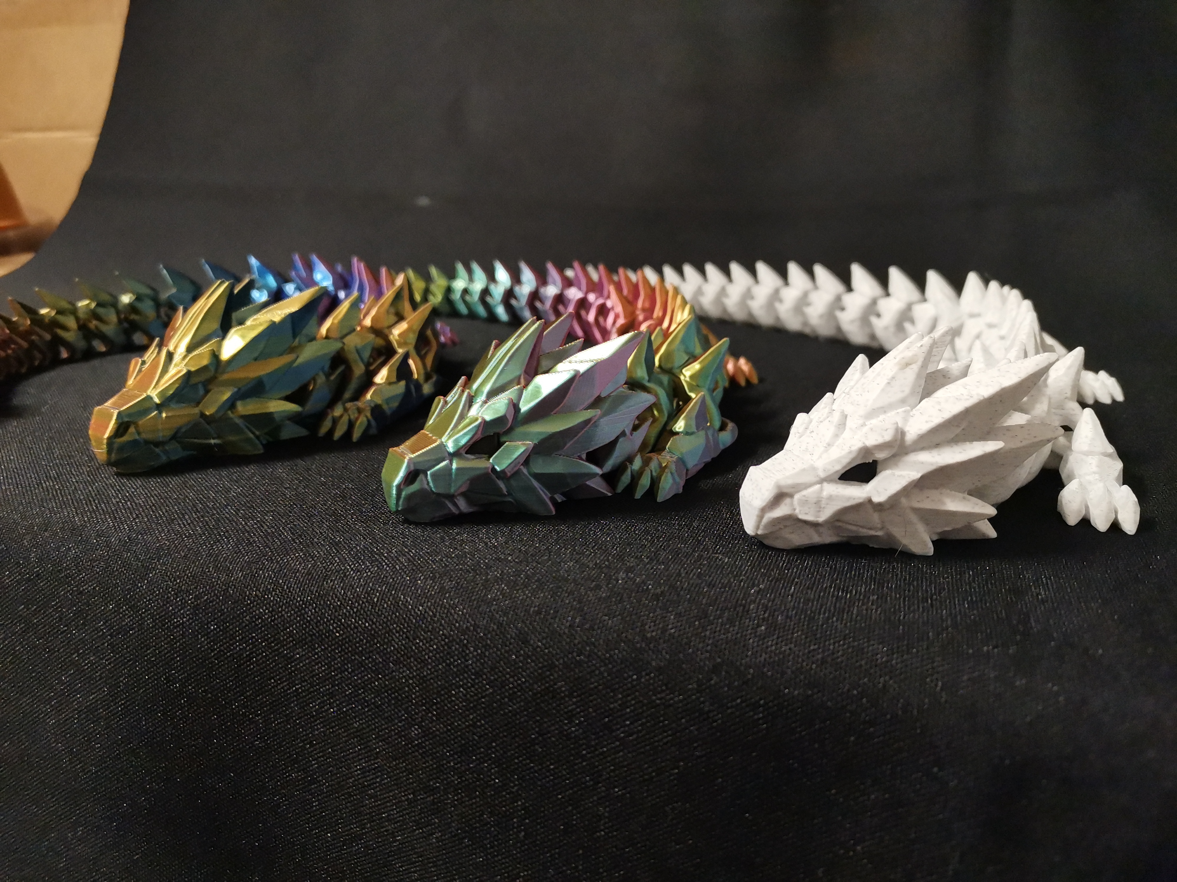
The model had a strong presence — lots of spikes, complex surfaces, and a very “wild” crystal aesthetic. It became one of those designs that instantly grabs attention, especially when printed with silk or gradient filaments.
But over time, I started to feel something.
It was almost too much.
Too many details, too busy, harder to read from a distance.
And that’s where the idea for a new direction came from.
🔄 Rethinking the Design
With the Prismfang Dragon, I wanted to explore a different philosophy:
👉 What happens if we simplify… but make it stronger?
Instead of stacking more and more detail, I focused on:
- cleaner surfaces
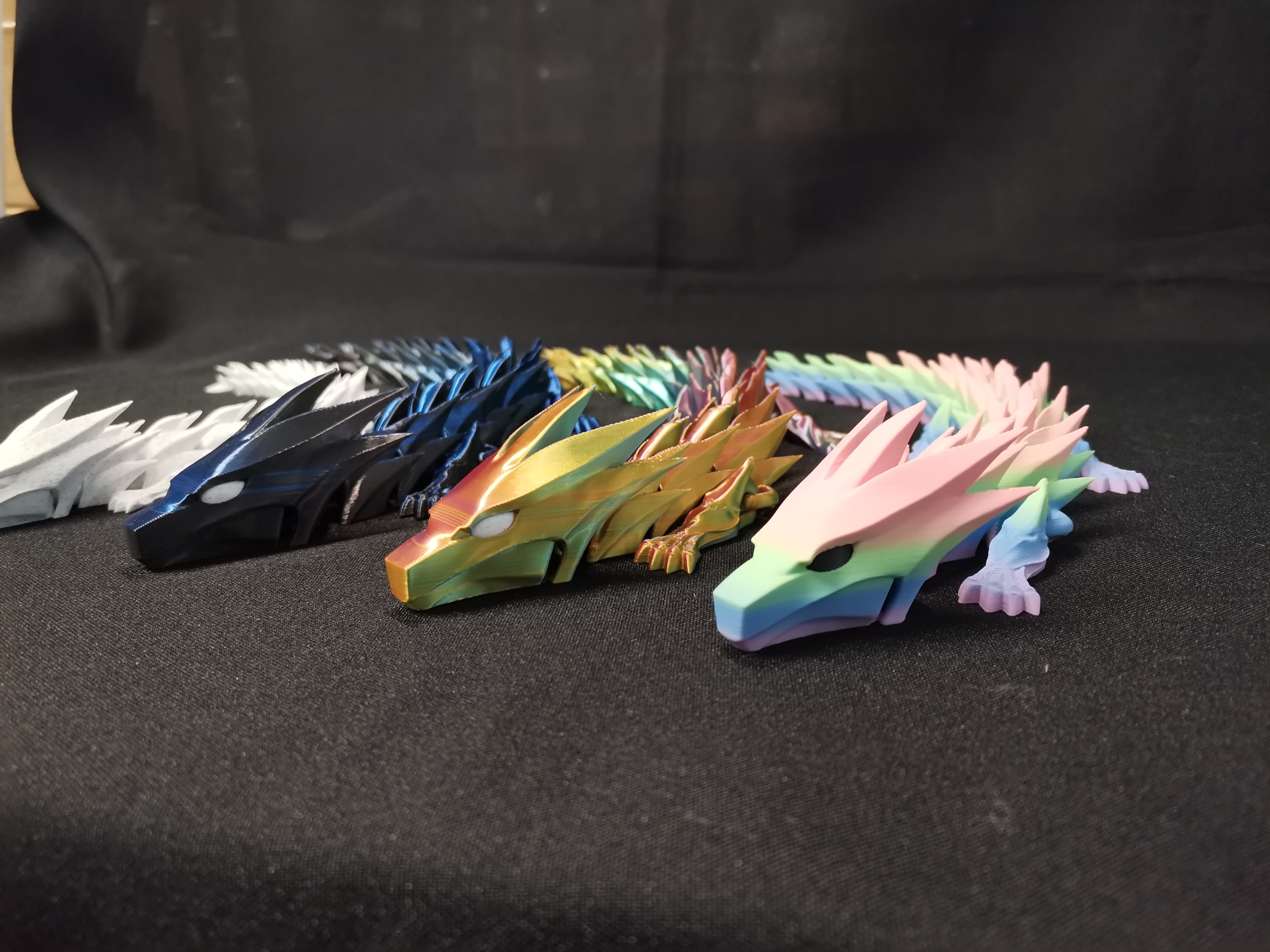
- sharper, more intentional shapes
- a stronger, more recognizable silhouette
The goal wasn’t to make it “simpler” —
but to make every single line count.
⚙️ Designed for Real Printing
One of the biggest lessons from the original dragon was print behavior.
So with Prismfang, I optimized for:
- smoother articulation
- more reliable print success
- better performance with multi-color and gradient filaments
This model really shines when you use:
- silk PLA
- dual / tri-color filament
- pastel gradients
The cleaner geometry allows the colors to do the heavy lifting.
⚔️ Old vs New – Two Different Personalities
Instead of replacing the original dragon, this became something else entirely.
- Crystal Dragon → chaotic, detailed, organic
- Prismfang Dragon → clean, aggressive, controlled
They feel like two different species — or maybe two different evolutions of the same creature.
And honestly… I like both for different reasons.
💬 What Do You Think?
This design direction might become a full series —
but that depends on you.
Would you like to see more dragons in this clean, sharp Prismfang style?
Or should I continue pushing the more detailed crystal direction?
Let me know your thoughts — and if you have ideas for future variations, drop them below 👇
🔥 Thanks for being part of the journey.