Sweet Rolls - Stackable 35mm Film Case (3-roll)


Print Profile(4)


Description
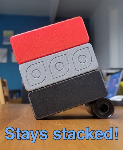
This is a convenient 3-roll 35mm film holder that is stylish and fits great when in the pocket, but is also designed for convenient stacking when you have a few on your shelf or desk.
When looking at various options for film holders to print, I came across a few options, but all of them lacked one thing or another to me. So using the growing list of “things missing from other designs" that was in my head at this point, I set out to design one for myself that ticked all the boxes (for me at least).
These are some of the things I wanted to include:
I took those two models, and decided to make some changes, both major and minor. Here are the noticeable things that I (hopefully) improved.
- Make the cases stackable, or semi-interlockable. The surfaces of 3D prints (particularly standard PLA) are pretty slippery. Look at two stacked together funny and they will slide apart. I wanted this design to be stackable, and more importantly STAY stacked on my desk. The interlocking ridges I've built into this design makes having multiple cases much more manageable.
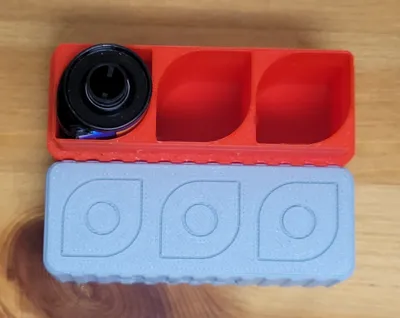
- Make the films easy to put into the case. No-brainer, right? You'd be surprised and what I've come across in some designs! I made sure to make the film holes a good size in all directions/dimensions for easy loading. The film canister can go in multiple different ways, so it's pretty dynamic.
- Make the films easy to take out of the case. Again, a no-brainer? You'd think, but in my experience that's not a given unfortunately. Along with what I mentioned about about the hold size being comfortable, I also made my design so that the film isn't completely submerged into the case. With my design, when fully in the case (bottom), the film can still somewhat protrudes, making it super easy to grab and remove.
- Add some style while being practical. I design the case with some reasonably unique film holes, contoured to be nice to look at (while staying very functional). I also integrated that design into matching icons on the very top of the case's lid, again nodding to it's design style and functionality.
- Make it compact, so it isn't intrusive. I went with a 3-roll design because that keeps the case very usable. It's a good size to slide into your pocket without being awkward or uncomfortable. I've found that for a photo walk, having three rolls is a perfect balance of having enough shots available and some flexibility in what films to have on-hand (B/W, Fast speed color, moody experimental, etc). Plus, if you need more, you can pack these cases according to need, and keep them organized.
- Make the case it self easy to work with. I make the top half of the case fully half the height of the entire case. This not only looks better to my eye but, more importantly, it also makes for a more usable lid that is both easier to take off and put on, being much less fiddly to worth with than many designs I saw that had small tops. I also designed it with a click-locking feature, so when the case is closed, it stays closed (great when it's flopping around in your messenger bag or wherever). The “click” is also really satisfying to both hear and feel. I also added indent/grip markers on one end, which serve two purposes. The first, and most useful is that it shows you how to line up the top and bottom pieces so that the interlocking notches/grooves line up the way they are supposed to. The second use is to provide a built-in grip area for separating the lid from the case.
Anyway, the above is a list of just some of the concepts/ideas that I put into this design. I hope you like it!
This design is two parts. The top (lid) and the bottom (base) of the case. For downloading/printing, I've made a folder structure, each folder being one variant containing both parts needed. There are four variants available, which should be easy to figure out based on the folder and file names. They are:
- Standard stackable case, with the words “Sweet Rolls” on the face, and the embedded icons on the top.
- Standard stackable case, with the words “Sweet Rolls” on the face, without the icons on the top. (You can add your own if you want)
- Standard stackable case, with the no words on the face, and the embedded icons on the top. (Semi-whitelabeled, but not for commercial use)
- Standard stackable case, with the no words on the face, and no icons on the top. (Fully-whitelabeled, but not for commercial use)
Note about printing:
If you print from one of my provided profiles, then I have a brim enabled. The brim really shouldn't be necessary at all, but I added it just to help ensure people get a good print. If you want to you can go ahead and disable the brim before printing. Just remember that if you do, that's your decision based on your knowledge of your machine's bed adhesion strengths and/or weaknesses. If you do print with the brim, it should remove very easily, but you might need ot do some fine-tun removal to get the best functionality of the “stackable” ridges.
Comment & Rating (12)