Dual Sided Morse/Phonetic Alphabet Pocket EDC Card


Print Profile(4)


Description
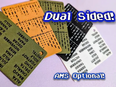
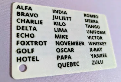
DUAL SIDED Morse Code & Phonetic Alphabet EDC Card
Did you look at all the other cards, and get a vague feeling of wasted potential? Did you think… “that raised text will just chip off”? Maybe you idly wondered at the blurry font choices, or perhaps the empty side of the card staring back at you whispered “you could have put something useful here”.
Look no further!
I put a silly number of hours into building this card from scratch. I present - a double-sided, Morse & NATO Phonetic Alphabet reference card!
I've tried to optimize every text character for readability and printability (there is more than one font happening in here). I put together two versions - a flush-text version (requires AMS) and a debossed-text version (can print without AMS!). Now you can study both radio alphabets in one handy, easy-to-print reference card, without worrying about durability!
Print them for your prepper friends to attach to every one of their bug-out bags!
- Flush Text Version: requires AMS.
- Debossed (cut out) Text Version: AMS optional. Insert pauses where the filament changes are and manually change your filament at the pauses.
📚 There are FOUR card thicknesses to choose from!
- 0.88mm - Credit Card Thin: Barely a hair thicker than a standard credit card. Should fit almost anywhere a standard CC will go. If you need your card to be ultra-thin for some reason, choose this one! This will NOT look good with many color combos because there just aren't enough layers - choose dark-on-dark or light-on-light.
- 1.04mm - Lite: Still pretty thin, will easily fit wallets etc. Gives a bit more sturdiness. My personal favorite.
- 1.20mm - EDC Strong: If you're planning on putting it on a lanyard or somewhere where it might take some abuse, this thickness has a bit of heft to it and should stand up to more abuse
- 1.36mm - Sturdy Chonk: Use it to jack up your car? It's hefty!
⚙️ Printing Tips:
- Use matte filaments for optimal results. The cards are thin and if you use translucent filaments it probably won't look good.
- Light colors for the base card may allow darker text color to show through. I would suggest mid-to-dark colors for the base card.
- A smooth plate is probably going to give best results. I don't have one so couldn't test it.
- If printing on a textured plate, I suggest putting the NATO phonetic alphabet side down as per the print profiles, as the text is larger and the shininess imparted by texturing will be less annoying when reading that side of the card.
- Top-surface ironing is on for all print profiles to give a nice smooth finish. If you don't like ironed surfaces for some reason, make sure to toggle it off.
- If you're printing the debossed versions, you might have issues with the middle bits of text characters adhering to the bed (like O's and A's). Make sure your bed is clean, let it cool down completely before removing, and if necessary, reduce the adhesion with a release agent like glue (I like windex) if you have real trouble.
Personally I think the flush-text versions are better for a number of reasons (easier to print, won't collect dirt in your pocket!), but enjoy both!
The license is a standard digital license for personal use only. You may gift them to your friends or students but no selling is allowed on this license.
License
You shall not share, sub-license, sell, rent, host, transfer, or distribute in any way the digital or 3D printed versions of this object, nor any other derivative work of this object in its digital or physical format (including - but not limited to - remixes of this object, and hosting on other digital platforms). The objects may not be used without permission in any way whatsoever in which you charge money, or collect fees.
Comment & Rating (96)