
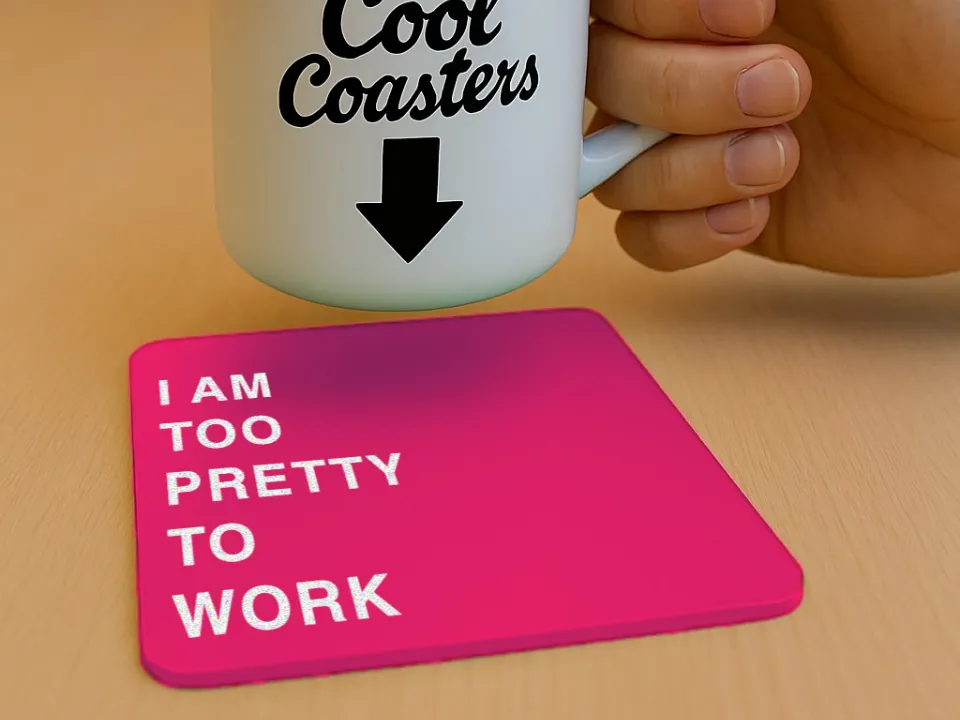
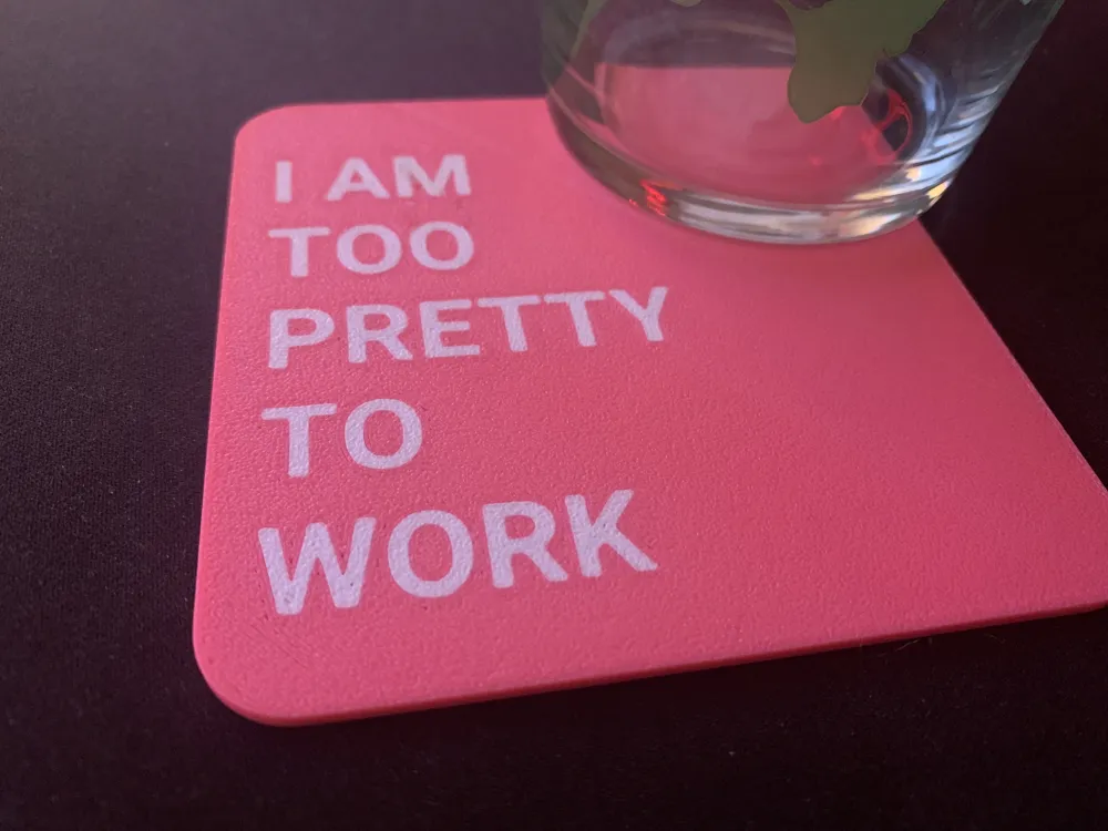
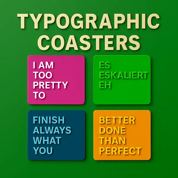
Typography Coaster - I am too pretty to work
Print Profile(1)

Description
🕺 „I AM TOO PRETTY TO WORK“ – The Coaster for the Man who Prefers to Pose Rather than Present
He leans casually by the water cooler, speaks in buzzwords, and looks like he just stepped out of a fashion catalog. His calendar? Full of „look good“-blocks. His laptop? Only opened when there's good lighting.
This coaster celebrates him:
- The guy who looks like a fashion editorial in every video conference 💅
- The colleague who spends more time on his hair than on annual planning 🕶️
- The man who doesn't work – he inspires
Because style knows no gender boundaries, and self-confidence is always in.
Like all my coasters:
- 2 mm thick
- 1.6 mm single color + 0.4mm (2 layers) text for good coverage and few color changes (3)
- Optimized color order (light - dark)
- Face-Down for optimal text
- I recommend turning on the prime tower
Check out the whole series, show me your color combination in the comments and rate the profile if you like :-)
Check out my other stuff and collections:


Appreciation
Boost Me (for free)
If you liked it, feel free to Boost me to support my work and keep me creating — your support truly means a lot! 📢 Everyone gets Boost tokens, which expire if not used. Use them to support your favorite artists 📢
License


Comment & Rating (13)